And what country can preserve its liberties if their rulers are not warned from time to time that their people preserve the spirit of resistance? Let them take arms. The remedy is to set them right as to facts, pardon and pacify them. What signify a few lives lost in a century or two? The tree of liberty must be refreshed from time to time with the blood of patriots and tyrants.
Just guessing, but how I'd make a 50% chart is to use a list of the cities and towns of the world in descending order of population, and place dots at the locations until I'd passed a cumulative population of 3,917,750,000. For the other charts, I'd use cities and counties (or the corresponding subdivisions in the countries), until I'd passed the respective cumulative populations.
Back in '13, John Robb posted a link to an analysis that said if we took the entire population of the world and housed them with the population density of New York, the entire world population would fit in Texas. If we gave them the population density of London, we'd have to add New Mexico, Louisiana and Arkansas.
If we gave the entire world's population the population density of suburban Houston, big ranch style houses, they'd fill the middle 23 states of the US.
All the talk about overpopulation is a bit exaggerated. Besides, the world's population is either shrinking or will start shrinking soon.
Not to pimp my blog, but Robb's "Resilient Communities" is apparently gone. I have the map at my blog and it has stuck in my mind since '13.
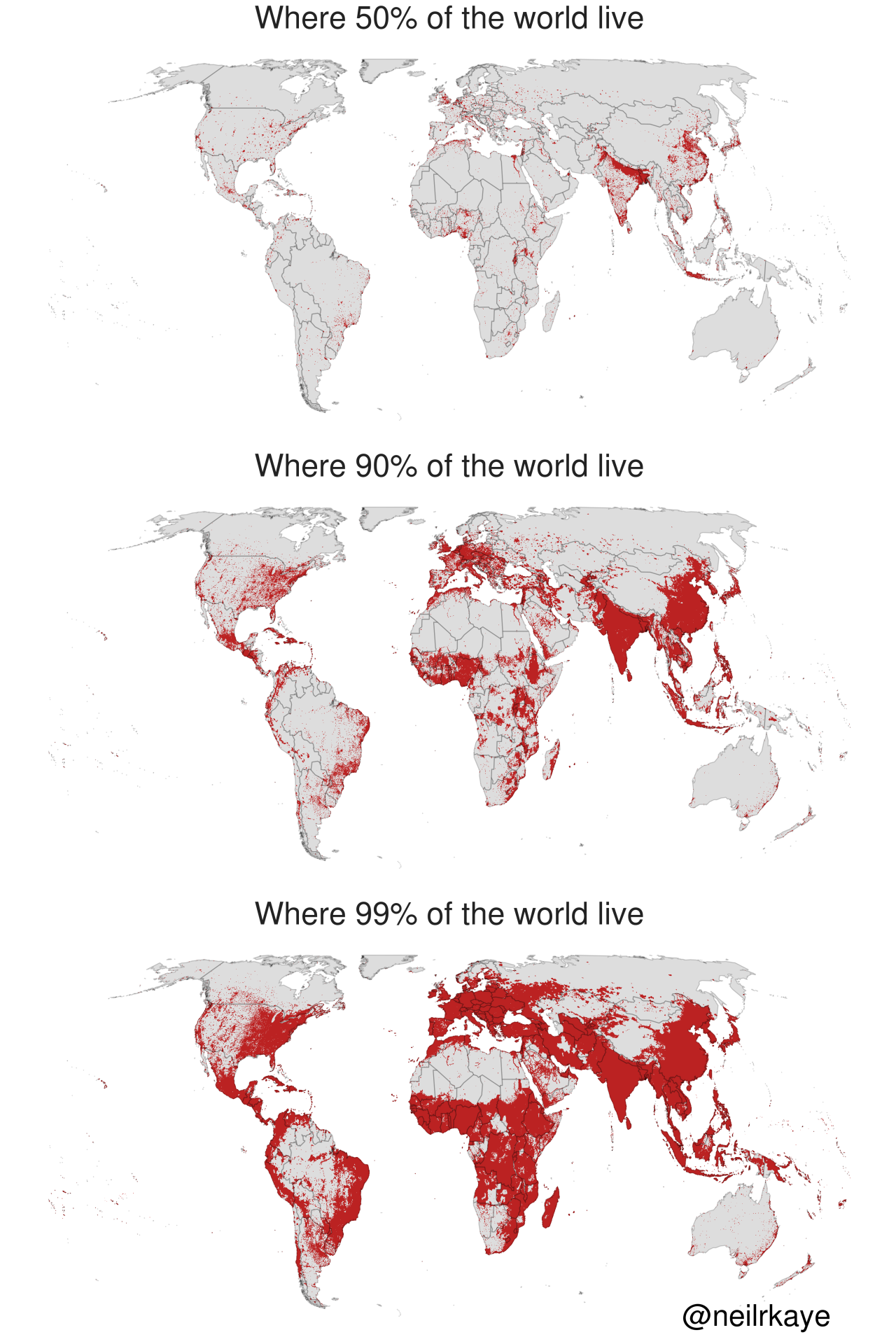
Somebody want to explain this to me ? I don't get it.
ReplyDeleteJust guessing, but how I'd make a 50% chart is to use a list of the cities and towns of the world in descending order of population, and place dots at the locations until I'd passed a cumulative population of 3,917,750,000. For the other charts, I'd use cities and counties (or the corresponding subdivisions in the countries), until I'd passed the respective cumulative populations.
DeleteHuh, India is not what I'd expect but there are a bunch of major rivers running along the northern boarder which probably explains it.
ReplyDeleteTechnically, the colors could be inverted on the 50% map, and it would still be correct. Think about that.
ReplyDeleteBack in '13, John Robb posted a link to an analysis that said if we took the entire population of the world and housed them with the population density of New York, the entire world population would fit in Texas. If we gave them the population density of London, we'd have to add New Mexico, Louisiana and Arkansas.
ReplyDeleteIf we gave the entire world's population the population density of suburban Houston, big ranch style houses, they'd fill the middle 23 states of the US.
All the talk about overpopulation is a bit exaggerated. Besides, the world's population is either shrinking or will start shrinking soon.
Not to pimp my blog, but Robb's "Resilient Communities" is apparently gone. I have the map at my blog and it has stuck in my mind since '13.
That's why I love Australia.
ReplyDeleteAnd Canada, once again, is shown to be a rather spacious nation!
ReplyDelete